Soy Up Branding and Collateral Design
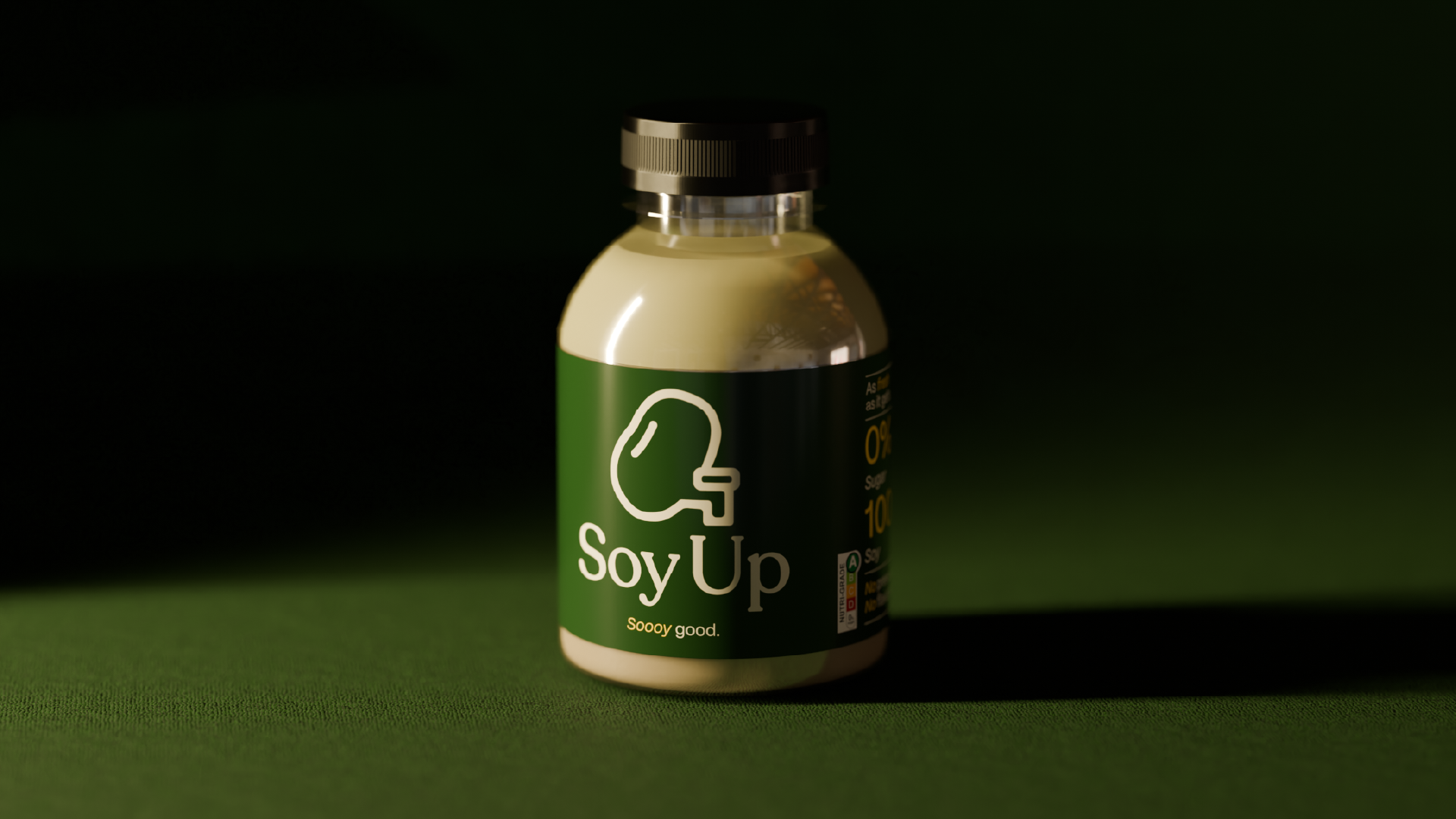
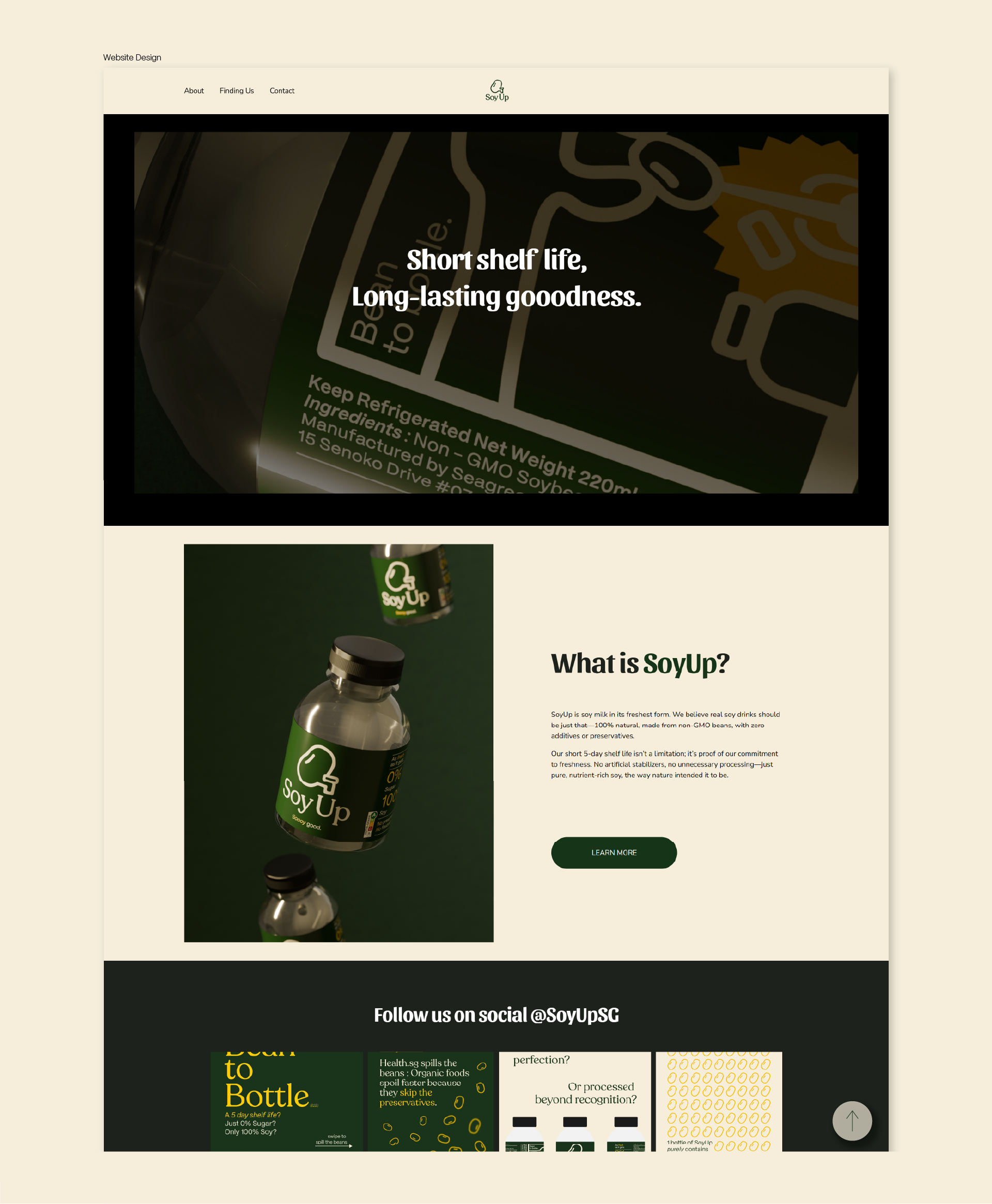
SoyUp is a soy drink brand conceptualized to serve health-conscious, middle-class consumers seeking freshness and transparency in their food choices. Rooted in a farm-to-table philosophy, the brand emphasizes minimal processing and a direct connection to nature.
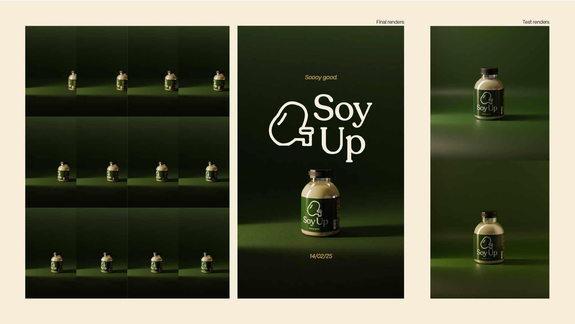
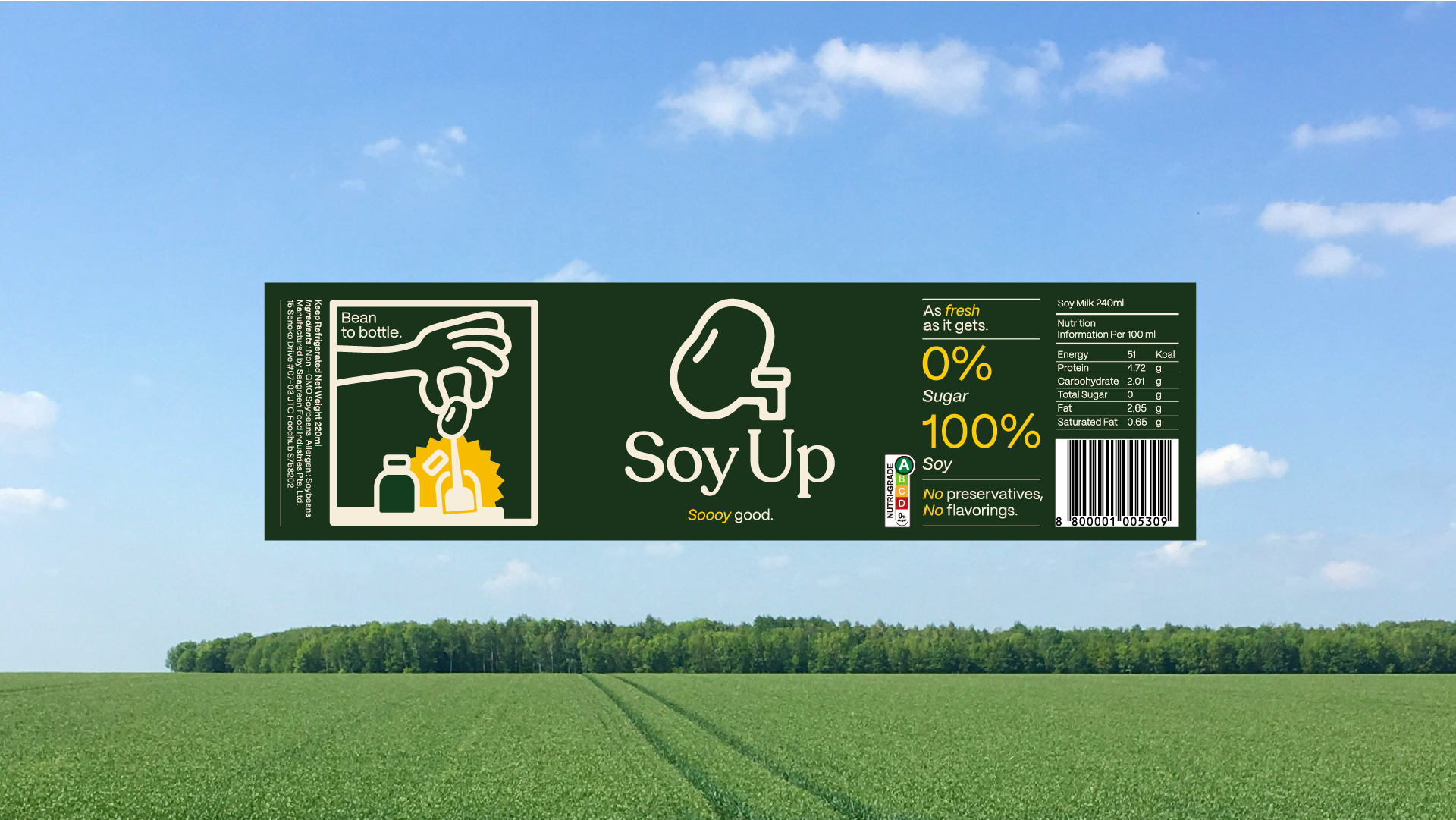
The packaging design aims to communicate this core value while standing out in competitive retail environments. With a focus on balance—between traditional soy-based nutrition and a modern visual appeal— SoyUp bridges heritage and contemporary consumer habits.
The packaging design aims to communicate this core value while standing out in competitive retail environments. With a focus on balance—between traditional soy-based nutrition and a modern visual appeal— SoyUp bridges heritage and contemporary consumer habits.
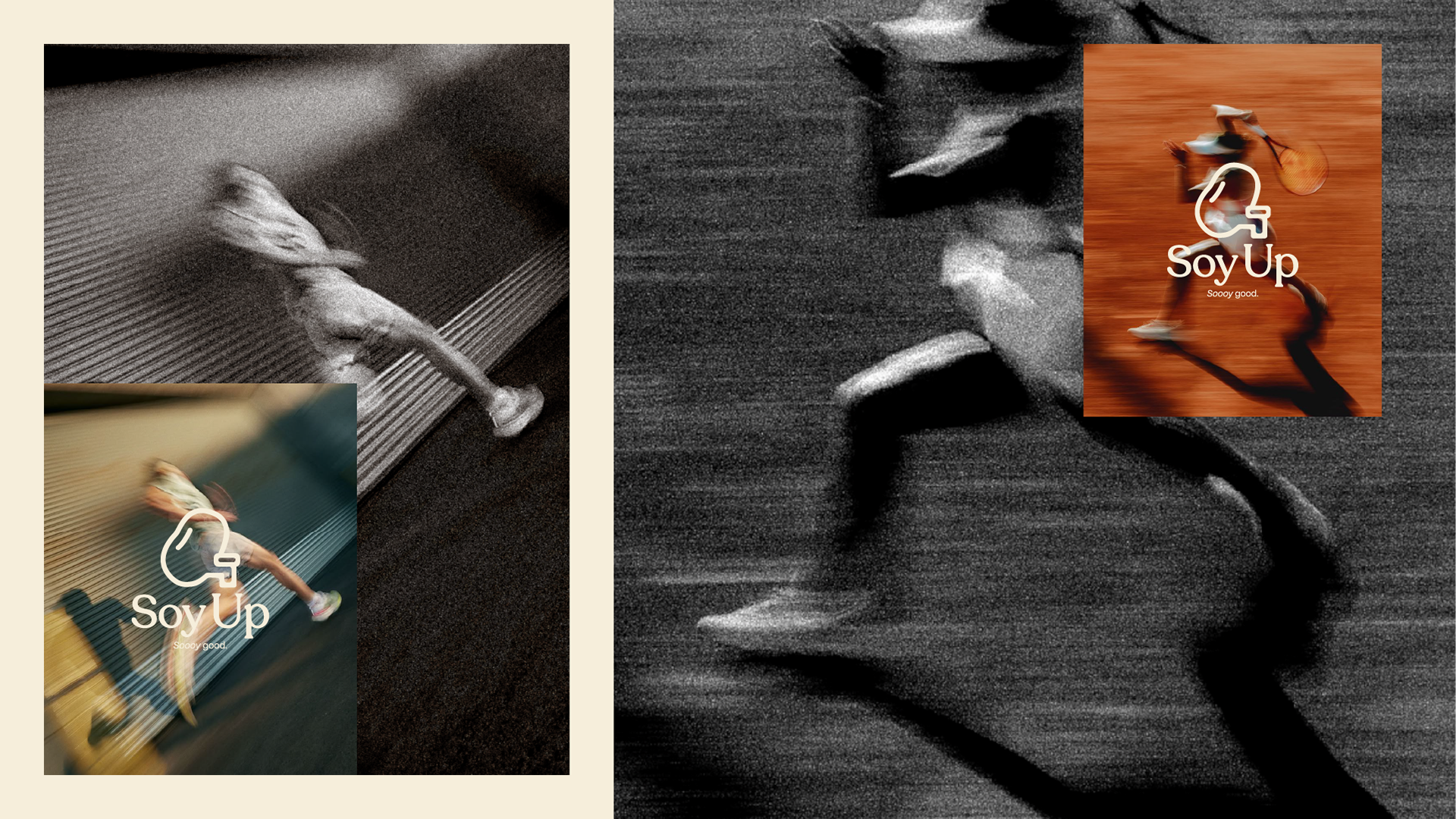
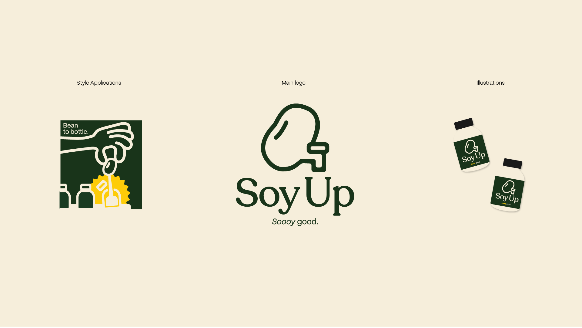
The design concept plays with an earthy yet vibrant color palette of dark green, green, black, and beige, evoking freshness and boldness. Clean typography and minimalistic layouts emphasize the purity and simplicity of the product
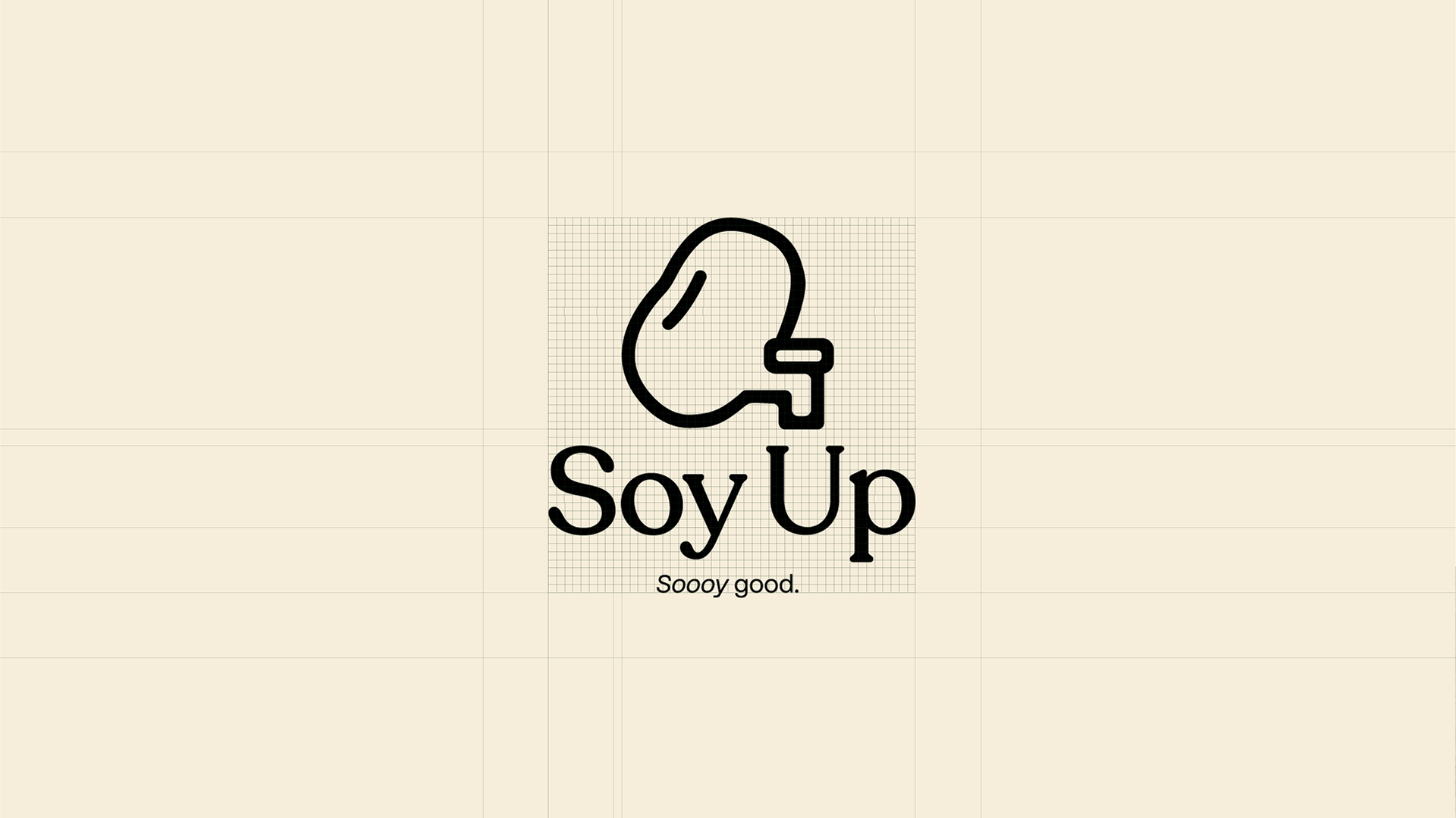
Logo Grids
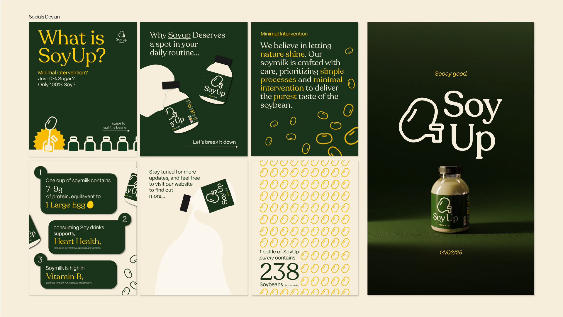
SoyUp Website