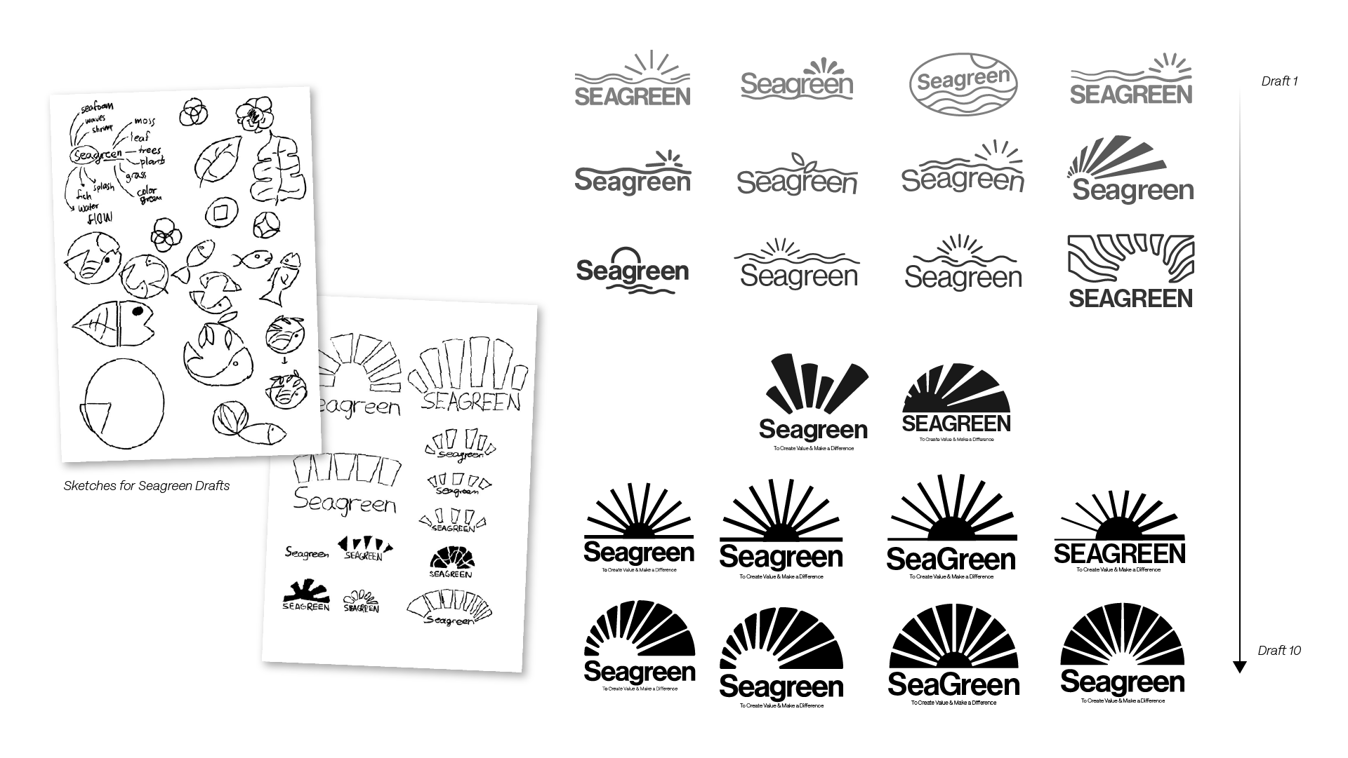
The initial moodboard explored Seagreen in its purest form, drawing inspiration from nature, the sea, gentle water ripples, constant wave movements, textured leaves, and morning rays breaking through mist.
It served as an important visual alignment tool, ensuring that both the client and I shared a clear understanding of the intended direction before moving into the full brand refresh. The mood-board helped establish the foundation for a visual identity rooted in freshness, nature, movement, and timelessness, representing values set within Seagreen's identity.

At the draft stage, back-and-forth collaboration with the client was important, ensuring that the design direction became more concrete, which would allow for a stronger foundation before the progression into more detailed iterations.
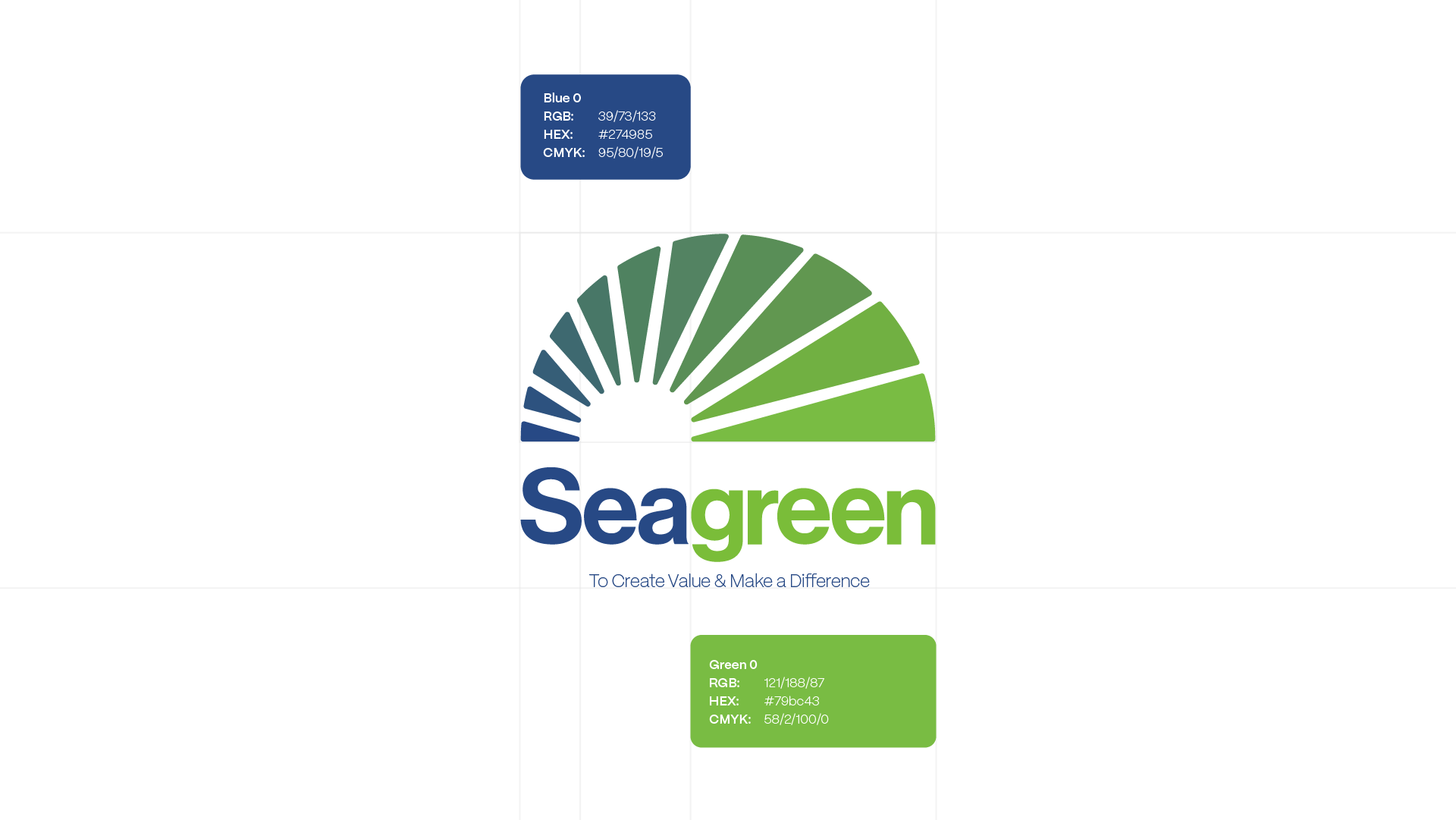
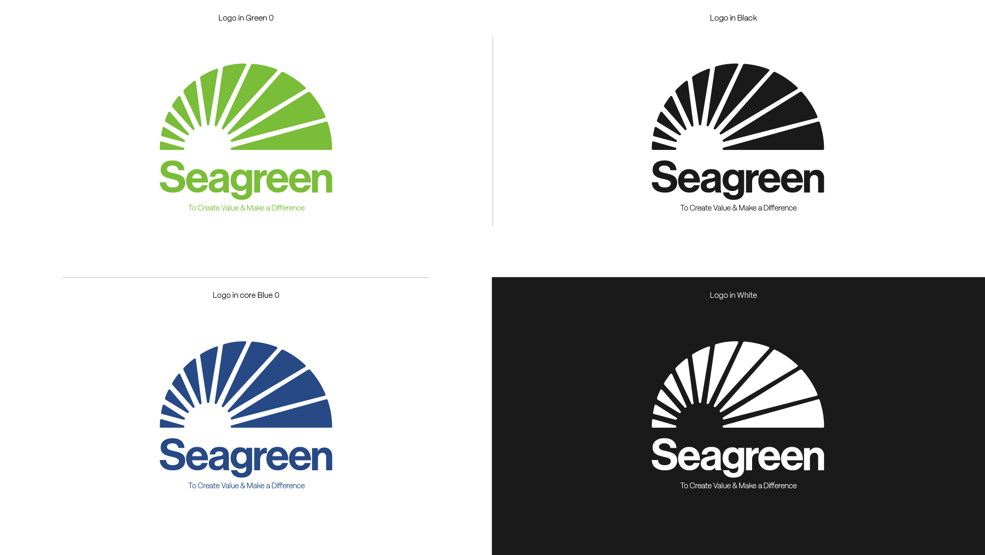
The final logo design centers on the concept that the Seagreen rebrand is built on creation, growth and forward movement. The sunrise represents the act of creating value, while the rays break through the sky, symbolizing Seagreen's ability to make a meaningful difference for its clients.
The use of negative space suggests openness and limitless potential, reinforcing the idea that Seagreen is not confined by boundaries. Together, the mark reflects impact, progress, and a renewed visual identity that feels both purposeful and enduring.

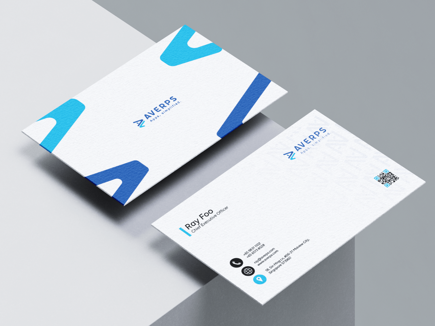
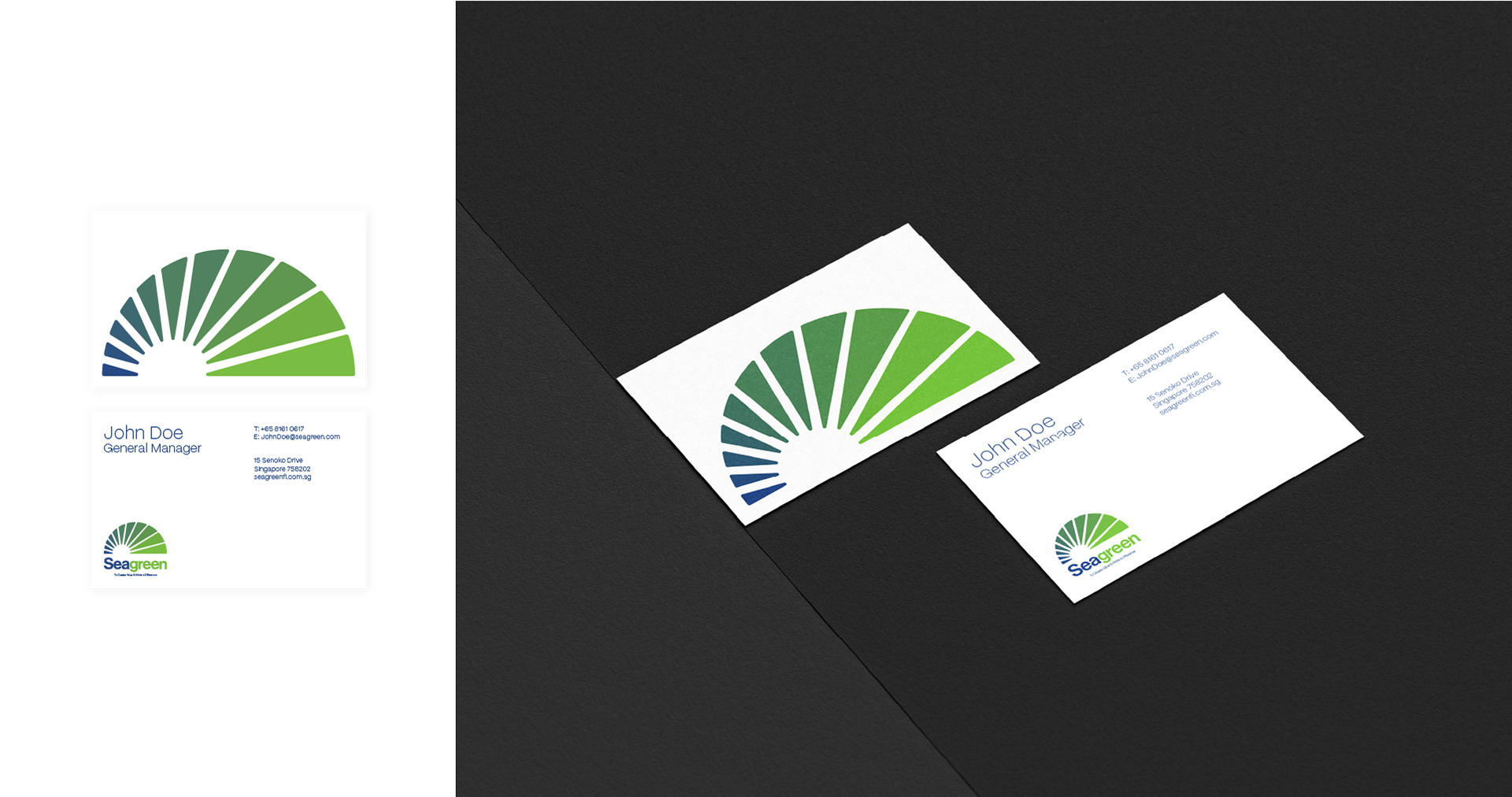
Name card design for the client to show further usage of the graphics and fonts.
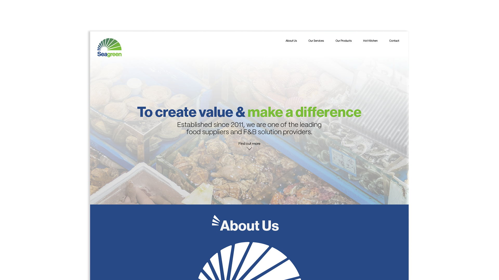
Website design to further show the element and colour usage possibilities.